Chosen Vitamins
Revitalizing wellness: Chosen Vitamins redesigned.
Originating as a South Florida-based company specializing in vitamins and supplements tailored to a niche audience, Chosen Vitamins decided it was time for a transformation in 2012 and 2013. The American vitamin market was ripe for a contemporary, energetic player, and Chosen Vitamins seized the opportunity to stand out.
Design objective
The mission was to redefine Chosen Vitamins' visual identity to not only differentiate it from competitors but also radiate a modern, arresting aura. Crafted with a graphic concept exclusive to Chosen Vitamins, the new packaging became the initial and most important point of contact with the audience.
Solution
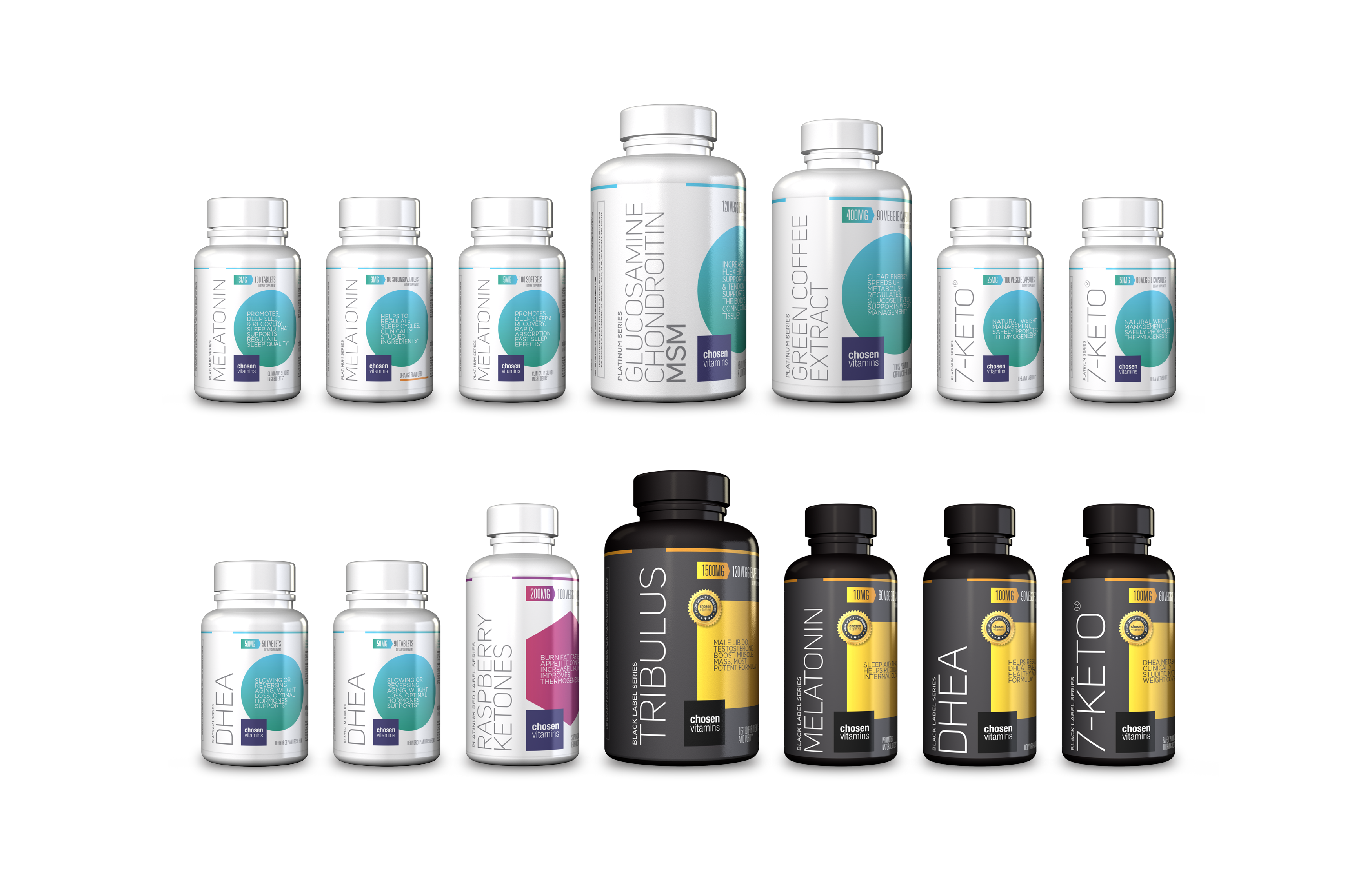
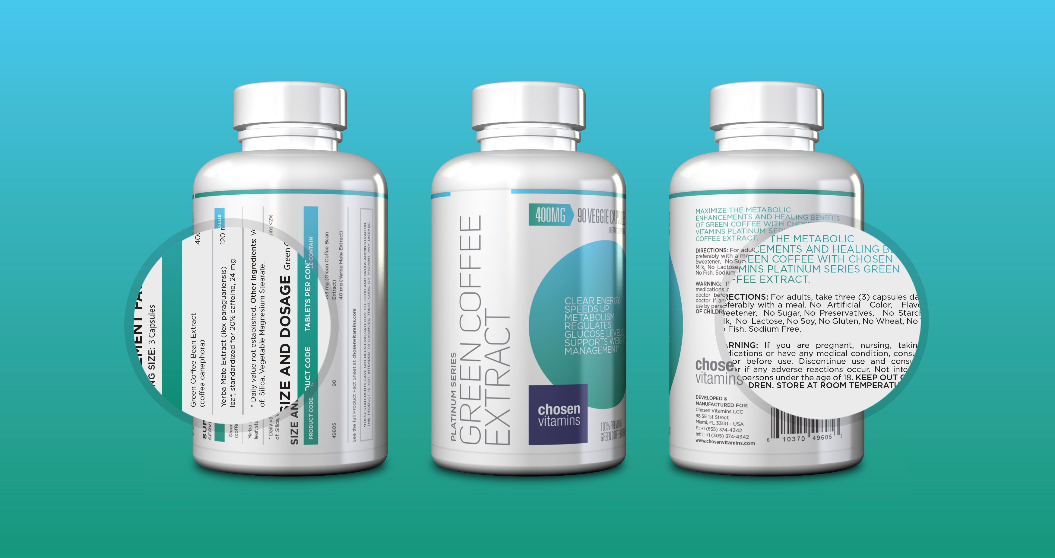
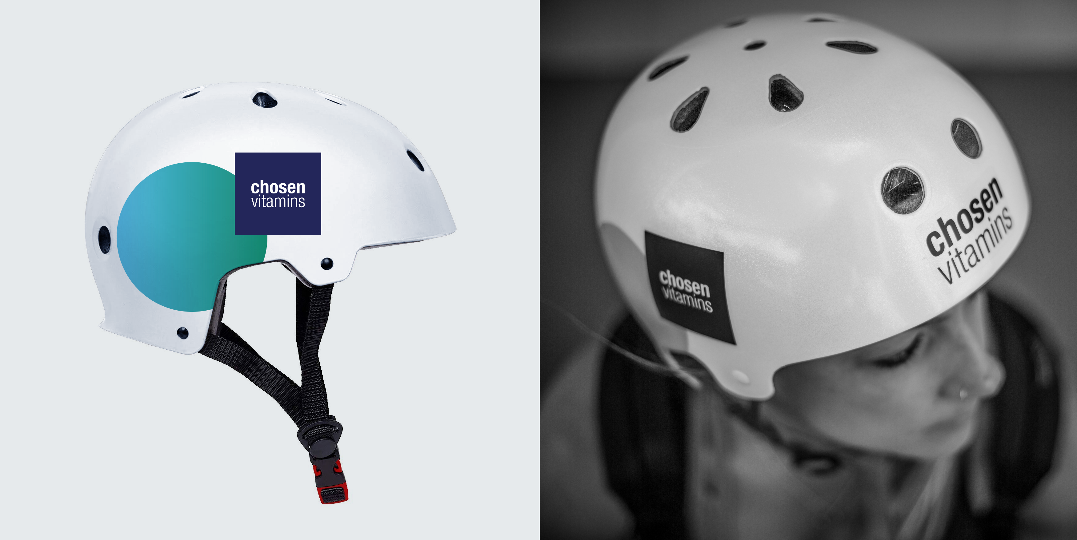
To ensure instant recognition at the point of sale, vibrant, eye-catching colors and geometric shapes took center stage. Set against a white background, the packaging not only pops on the shelf but becomes a visual beacon in any context. The strategic use of contemporary design elements positioned Chosen Vitamins as an alternative for those seeking a dynamic and lively approach to health.
Results
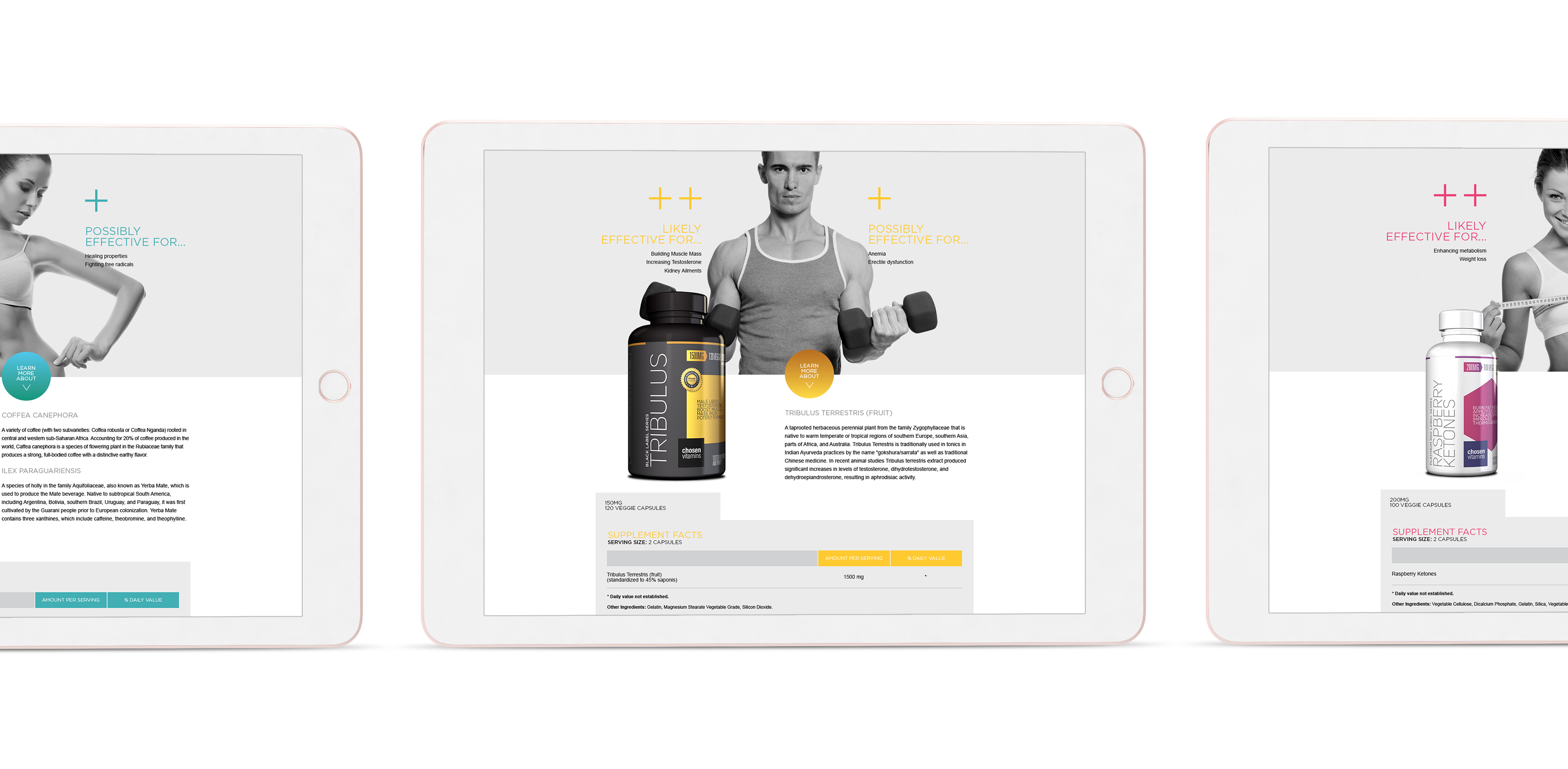
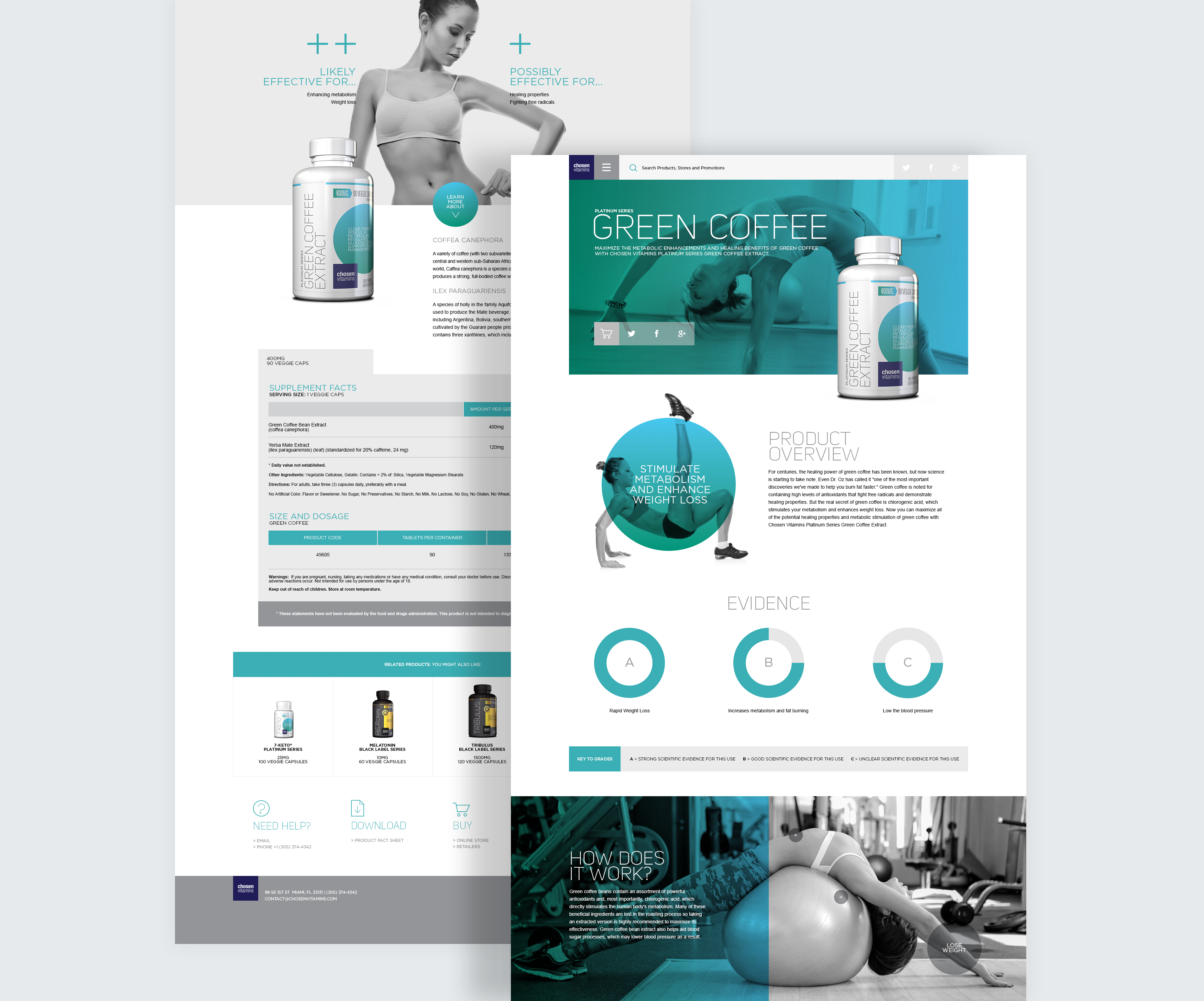
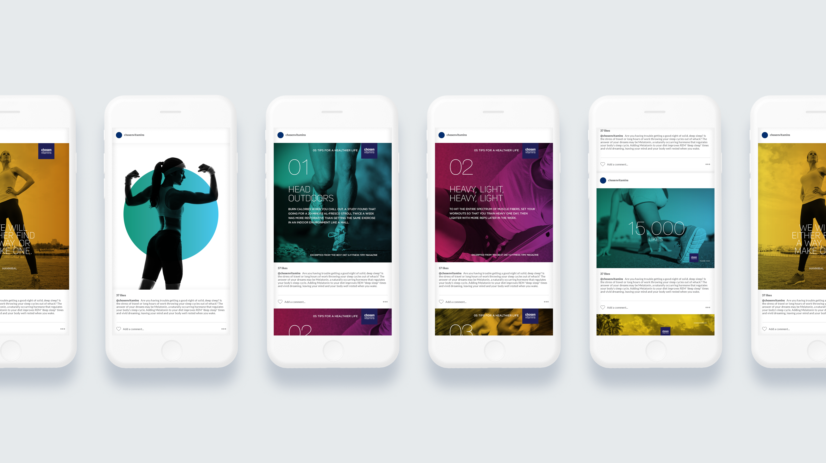
The redesigned packaging not only elevated perceived quality but also resonated with the health-conscious, emphasizing an active lifestyle. Beyond packaging, the design philosophy extended globally on the website and social channels.
The changes made a significant impact. The presence in the market increased, and consumers showed a heightened interest. The updated website, with personalized features, improved the overall user experience. By customizing content based on age, gender, and preferences, the simplified navigation built stronger connections with the consumer base.
In essence, Chosen Vitamins' rebranding goes beyond visuals; it signifies a strategic move towards universal resonance. It became a lifestyle choice, not just a supplement.